Contrast in Design
There are many principles of design that assist in creating a space that is orderly, put-together, and has a visual flow. However, some elements of design exist to counteract that in a way that still retains visual appeal. Chief among these is contrast, which, incidentally, is also one of the biggest interior design trends for 2018. Let’s take a look at how to achieve this look and how designers are skillfully implementing it in the modern age.
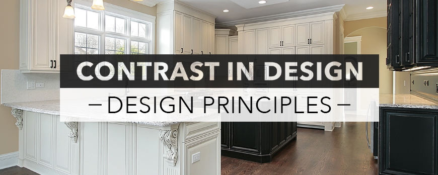
Contrast refers to differences in color, luminance, texture, or shape of objects and decor, which allows the eye to differentiate between them. A plain white room would be tedious—reminding one more of a sterilized asylum than a space in which they’d like to live—so contrast is implemented to create visual interest, while still retaining some of the order that is created by other principles, namely balance, repetition, scale, and unity. Interior designers, like artists, use color, form, and space, to create contrast within a room.
Color is pretty self-explanatory, however, techniques must be learned within each category. Designers may stick with complementary colors within a room to create a more cohesive look or they could select two very opposing colors, such as black and white for a high-contrast look. High-contrast as a whole is ‘in’ for 2018, with many seeing a resurgence of bold white-and-black dominated rooms in the near future. However, this differential look could even be done within a single print, such as florals, says designer Jennifer Ott, favoring “bold, graphic floral prints in high-contrast colors such as black and white or teal and gold,” for 2018.
Form and space often go hand-in-hand, as one may choose different forms of furnishings to occupy space within the different room in a variety of ways. Combining rectangular couches with circular mirrors, curved chairs, and square side tables can assist in helping a room not look one-dimensional. Divide any room into separate usable spaces, with seating, working, and walking areas that are proportional and assist in flow. Accurately adjust these depending on the room—a bedroom will have larger pieces of furniture with less walking space while an area for entertaining guests, such as a foyer, living area, or kitchen, should have lots of room to mill about and work.
Learn more about the principles of design with our blog on Balance in Design, and join us at www.FederalBrace.com to create your own high-contrast kitchen look.


