Balance in Design
The pillars or principles of design mandate that each proper and intelligent interior design must encompass and incorporate repetition, scale, proportion, harmony and, above all, balance. Without balance within the home, structures aren’t sound, rooms can look chaotic, and there is no flow. That’s not to say things can’t be messy ever so often. Even the most austere of designers will tell you that there can be beauty in eclectic eccentricity. However, creating balance can be done regardless of taste - traditional, modern, contemporary, industrial, bohemian or avante-garde.
Let’s introduce the three components of balance: Symmetrical Balance, Asymmetrical Balance, and Radial Balance. Now, we’ll let them speak for themselves.
Symmetrical balance is achieved through mirroring objects along a central axis. This type of balance is stable, easy to achieve, and difficult to mess up, however, according to Hatch Interior Design it’s often considered to be “static, dull and unimaginative,” given the predictability of the design. That doesn’t mean that a designer couldn’t get more inventive, through incorporating patterns, unexpected lighting, unique fixtures, and pops of color. Maria Jones of the Interior Editor recommends those straining for symmetrical design take the central axis of a focal point in a given room and “work outwards mirroring either side of it design elements such as furniture, lighting and objects.”
Asymmetrical balance is, you guessed it, the opposite of symmetry. Rather than identically mirroring the objects used to create a perfect image, asymmetrical balance focuses on the respective visual weights of objects in order to create a balanced overall flow. It’s more dynamic than symmetry, providing more visual movement rather than the calm centering effect of symmetrical balance, however that isn’t to say it’s not balanced. Technique is key here, and those who have an eye for design are more apt to choose asymmetry than those who choose to play by the book. Designers may play with light and dark, complex shapes, textures, color, and lines to achieve this much-desired look within a space, creating a look that is visually arresting, unexpected, and absolutely beautiful.
Radial balance is the practice of radiating similar or alike elements around, away from, or toward a focal point. Attica Furnishings says that “radial balance is not as commonly used in interior design,” though it does encompass one of the other themes of interior design: repetition. Jones affirms this, stating that radial balance is “rarely used in traditional homes” but more common in “hotels and office spaces as [it] often create[s] stunning results.” Radial design must be carefully used within a room and also very minutely placed. The focal point must always be central or else it could become disorganized. However, nailing this look can create a very modern, sleek look that practically oozes feng-shui.
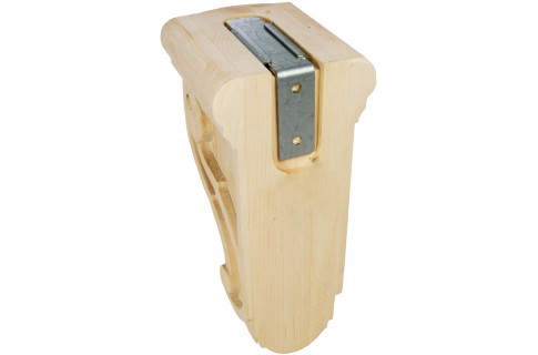
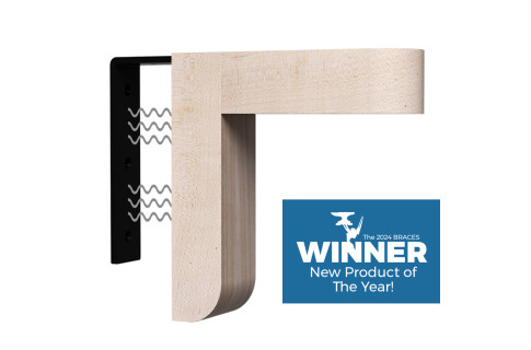
Designers may choose to incorporate one or several of these themes within a given room, combining them in a playful way that is simultaneously structured and has visual and spatial flow. Take a look at how we choose to create balance with our hidden supports integrating unexpected lighting at www.federalbrace.com.


